Roster trends let managers track hours, pay and labour costs in one place. This article explains how to open the roster trends screen, read each chart and use the statistics card. You will learn to spot overtime, monitor average pay and compare projected labour spend against budget. Clear steps show you where to tap, what each graph means and why the data matters. By the end, you can make faster staffing decisions and keep costs under control—all from your phone.
1. Access roster trends on mobile
This section guides you to the roster trends screen in the RosterElf mobile app. You will see how to open the app, land on the home tab and confirm that the trends ribbon is active. Follow the steps to reach the data in seconds.
1.1 open the RosterElf app
1.1.1 Unlock your phone.
1.1.2 Tap the RosterElf icon.
1.1.3 Sign in with your email and password.
1.2 navigate to the trends ribbon
1.2.1 Check the Home tab at the bottom left.
1.2.2 Confirm the ribbon at the top reads Trends.
1.2.3 If another view shows, swipe until Trends appears.
2. Interpret roster trends charts
The roster trends screen shows three key charts. Each graph covers the last six weeks and uses real roster data across every site. Reading these charts helps you adjust staffing before problems grow.
2.1 rostered hours per week
2.1.1 Read the bars to see total hours each week.
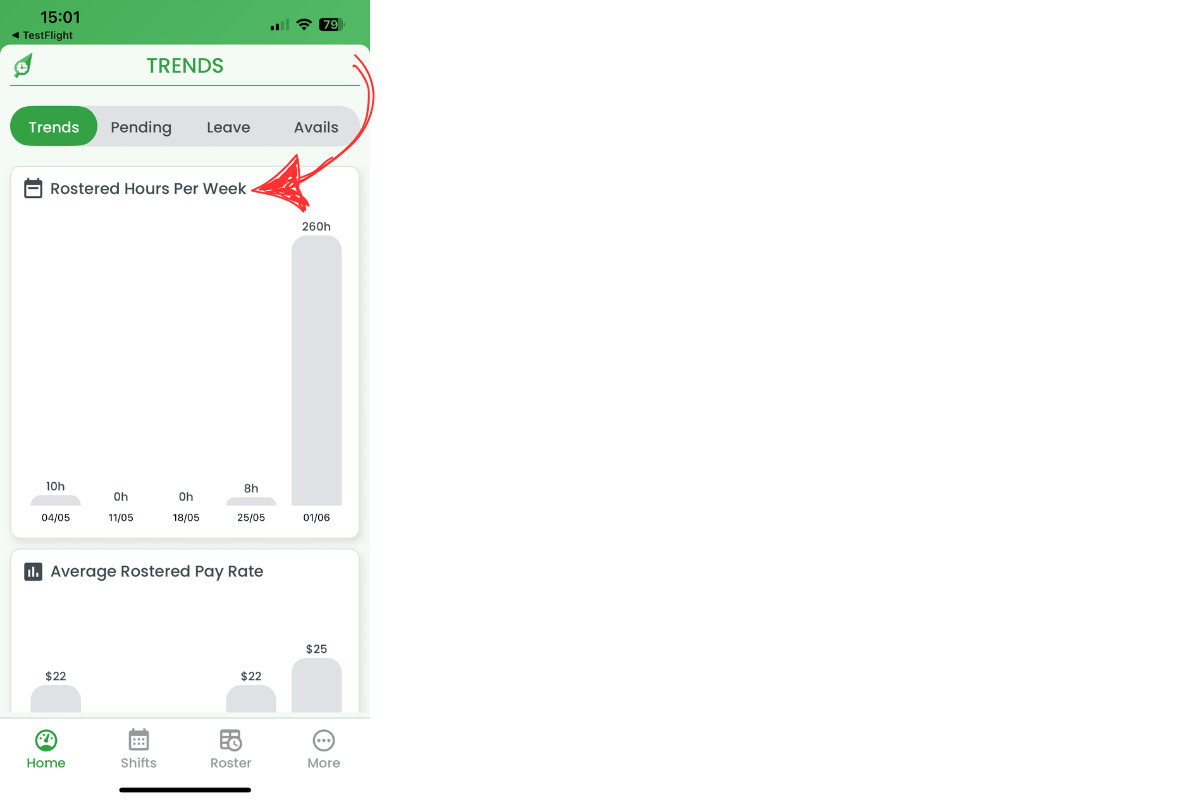
2.1.2 Spot peaks that signal overtime risk.
2.1.3 Note lows that may allow shift cuts.
2.2 average rostered pay rate
2.2.1 Check the line for average hourly pay.
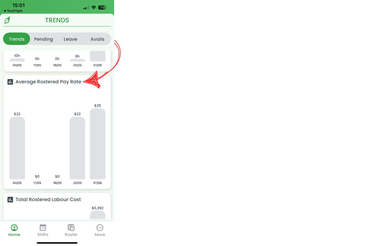
2.2.2 Watch for sudden jumps that raise labour spend.
2.2.3 Adjust staffing mix if rates climb.
2.3 total rostered labour cost
2.3.1 View projected weekly labour cost.
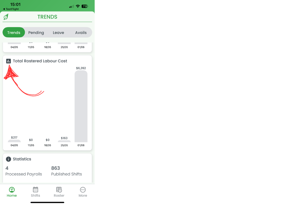
2.3.2 Compare the figure to your budget.
2.3.3 Revise rosters when costs exceed targets.
3. Review roster trends statistics
Below the charts sits a statistics card. It lists processed payrolls, published shifts, clock-in events and admin metrics. This snapshot verifies activity levels and system health.

3.1 use the statistics card
3.1.1 Note processed payrolls to confirm pay runs.
3.1.2 Track published shifts to gauge scheduling volume.
3.1.3 Watch clock-in counts to spot attendance issues.
3.1.4 Review admin hours and cost for overhead control.
Roster trends mobile FAQs
1. What is the roster trends dashboard?
The roster trends dashboard is a mobile view that tracks weekly rostered hours, average pay rates and projected labour costs across all sites.
2. How do I open roster trends on the app?
Sign in to the RosterElf mobile app, stay on the Home tab and check the top ribbon—swipe until it displays Trends.
3. How many weeks of data does roster trends show?
The dashboard displays six weeks of historical data, letting you compare recent roster performance at a glance.
4. Why should I monitor the average rostered pay rate?
Watching the average pay rate helps you detect wage increases early and adjust staffing before labour costs rise.
5. How does RosterElf calculate total rostered labour cost?
The app multiplies rostered hours by pay rates and applies award interpretations, giving you a projected weekly labour spend.
Frequently asked questions
1. What is the roster trends dashboard?
The roster trends dashboard is a mobile view that tracks weekly rostered hours, average pay rates and projected labour costs across all sites.
2. How do I open roster trends on the app?
Sign in to the RosterElf mobile app, stay on the Home tab and check the top ribbon—swipe until it displays Trends.
3. How many weeks of data does roster trends show?
The dashboard displays six weeks of historical data, letting you compare recent roster performance at a glance.
4. Why should I monitor the average rostered pay rate?
Watching the average pay rate helps you detect wage increases early and adjust staffing before labour costs rise.
5. How does RosterElf calculate total rostered labour cost?
The app multiplies rostered hours by pay rates and applies award interpretations, giving you a projected weekly labour spend.